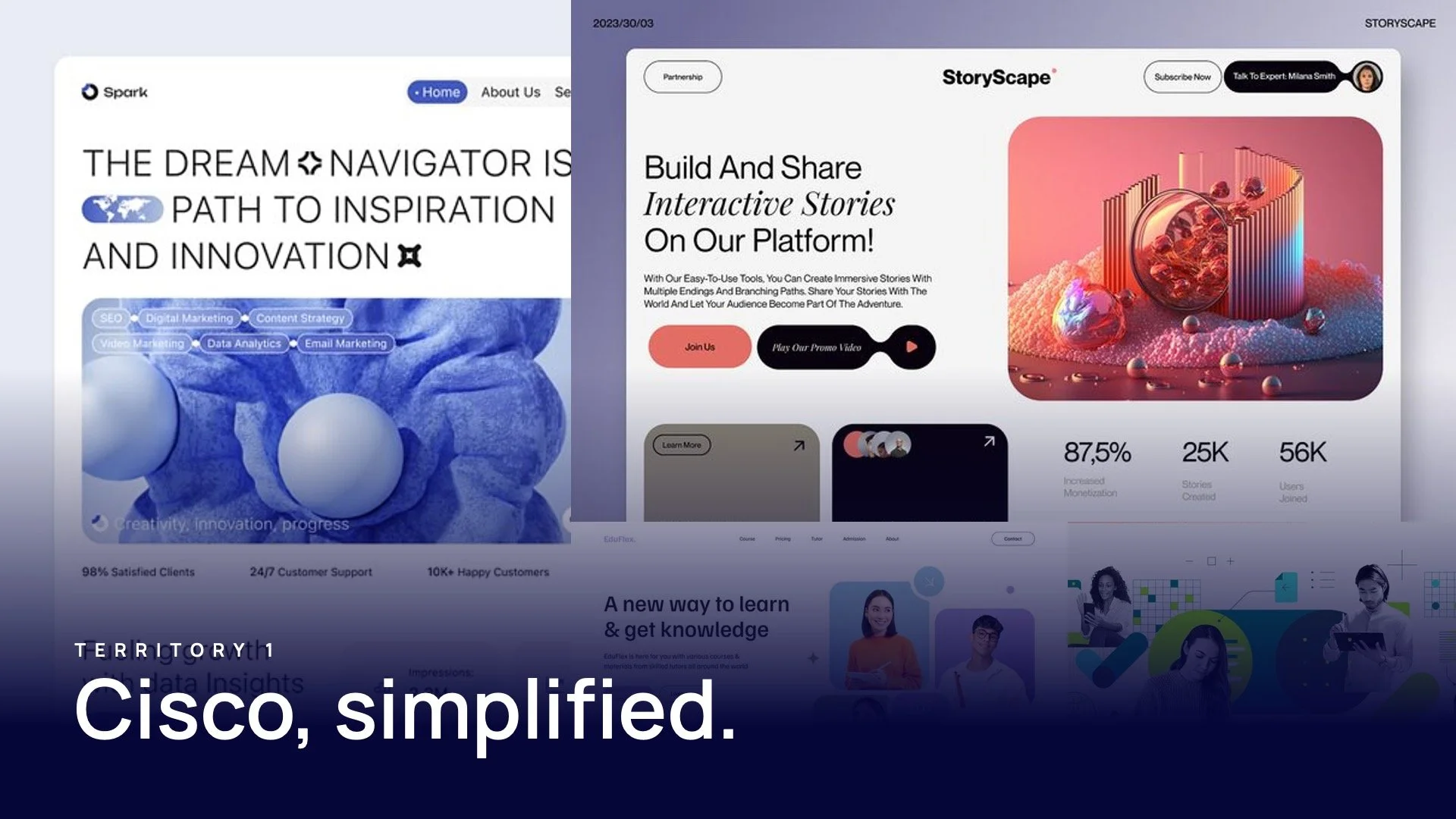
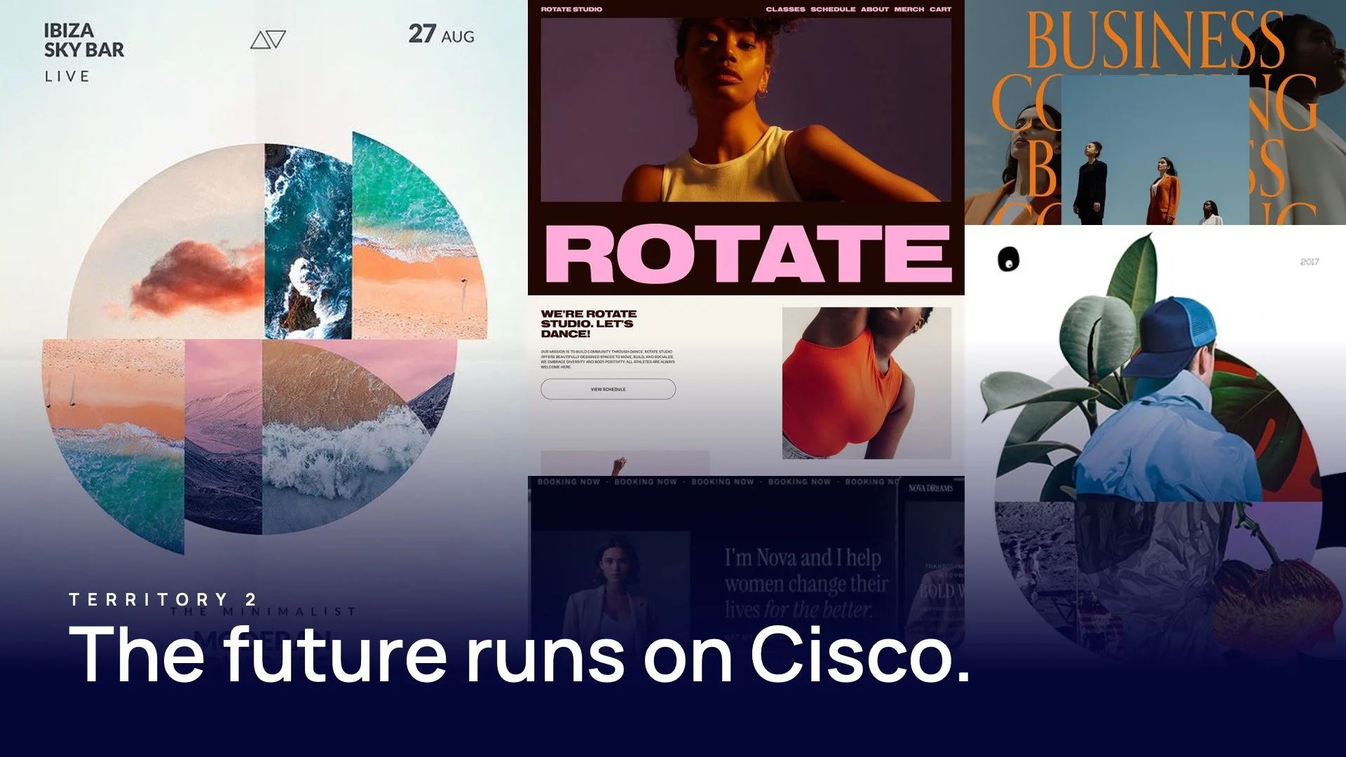
Cisco Website Redesign
Simplifying one of the most complex tech ecosystems on the internet
The challenge
Cisco isn’t just a company—it’s an ecosystem.
With decades of innovation across networking, security, cloud, and collaboration, Cisco’s digital presence had grown into something massive:
Thousands of pages
Multiple audiences (enterprise, SMB, developers, partners)
Deeply technical products and solutions
The result:
A site that contained everything—but made it hard to find anything.
For a company that “securely connects everything” , the experience itself felt fragmented.
The insight
Complexity isn’t the problem.
Unstructured complexity is.
Users weren’t failing because Cisco lacked content—they were failing because the experience didn’t guide them:
What is this?
Is it relevant to me?
What should I do next?
The opportunity was not to reduce what Cisco offers—
but to organize it in a way people can actually navigate.
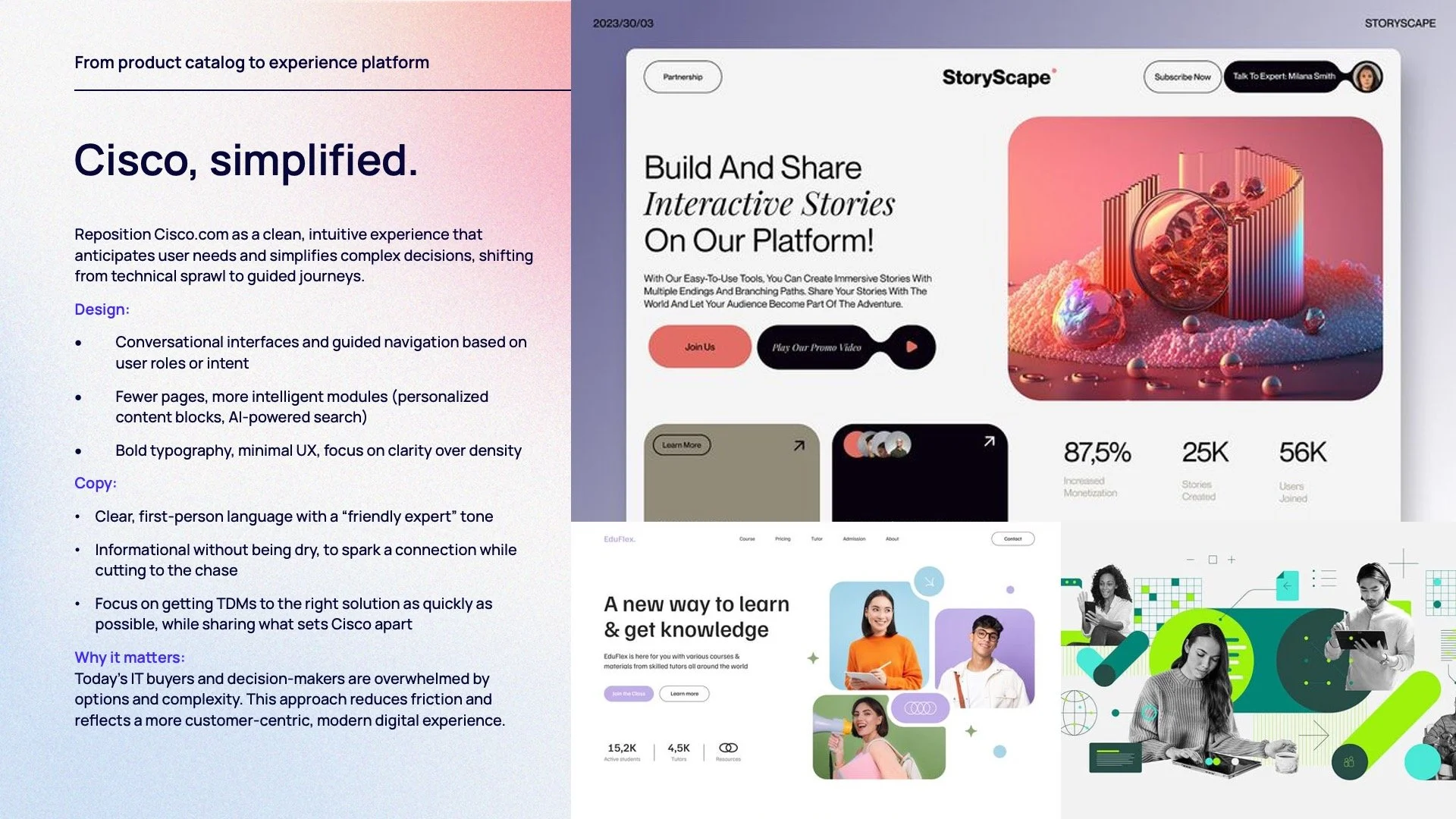
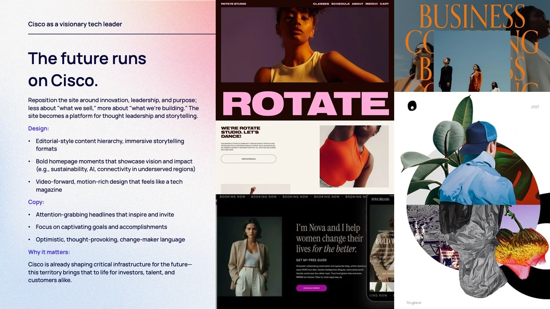
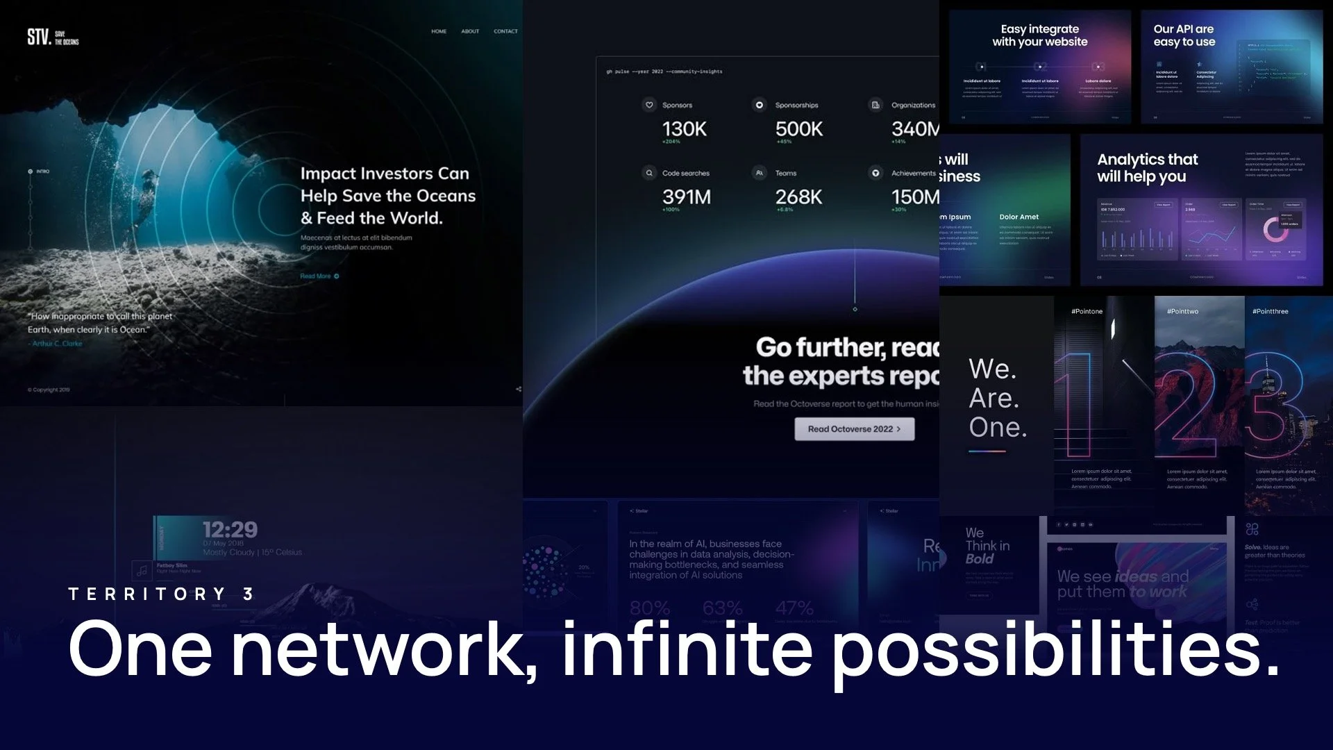
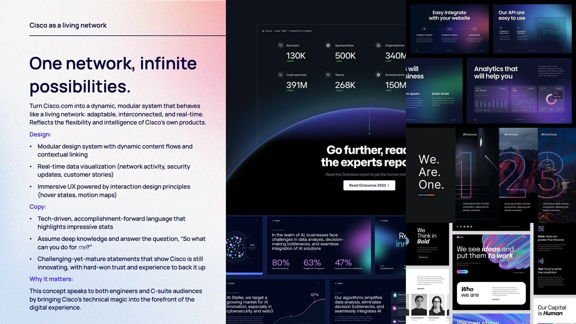
The idea
Turn the website into a system—not a collection of pages.
We reimagined Cisco.com as a structured, scalable experience that:
Guides users by intent, not org chart
Connects products to solutions and outcomes
Makes a vast ecosystem feel coherent and usable
Not a redesign.
A re-architecture of how Cisco shows up digitally.
The approach
1. Design for multiple entry points
Users don’t start at the homepage.
We built a system where every page acts as a clear entry point—immediately answering:
What this is
Why it matters
Where to go next
2. Shift from product-first to solution-led
Instead of forcing users to understand Cisco’s structure, we reorganized content around:
Business needs
Industry use cases
Outcomes and capabilities
Connecting technical depth to real-world relevance.
3. Build a scalable design system
A modular system of components and templates created consistency across thousands of pages—while allowing flexibility for different content types and audiences.
4. Reduce friction, increase momentum
We streamlined navigation, clarified hierarchy, and improved content flow—so users move forward instead of getting lost.
The experience
A restructured digital ecosystem that:
Makes complex offerings easier to understand and explore
Connects products, solutions, and stories into a cohesive journey
Supports multiple audiences without fragmenting the experience
Scales with Cisco’s ongoing innovation
The result is a site that feels less like documentation—
and more like a guided system.
My role
Creative Director
Led the overall vision for restructuring Cisco’s digital experience
Defined the shift from product-first to solution-led storytelling
Guided UX, content strategy, and design system development
Aligned cross-functional teams across a large, complex organization
Ensured the experience balanced depth with usability
The impact
Transformed a fragmented site into a more intuitive, navigable system
Improved clarity across Cisco’s broad and complex portfolio
Created a scalable foundation for future growth and content expansion
Strengthened how Cisco communicates its value across audiences

The TakeawayWhen everything is important,
structure becomes the strategy.
This project wasn’t about redesigning pages.
It was about helping people move through complexity
—with confidence.